The Passing of Lettering Artist Michael Clark

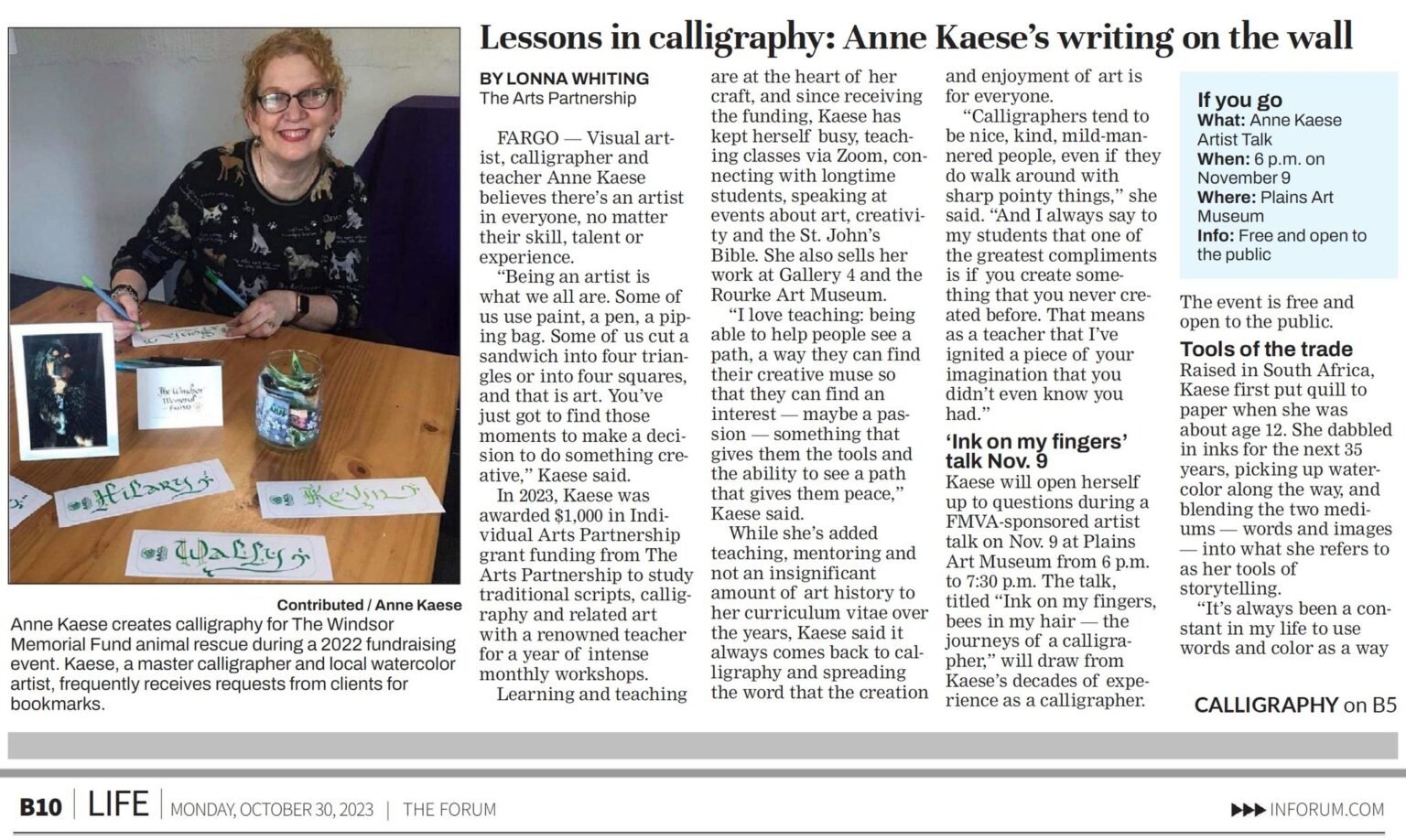
From the Washington Calligraphers Guild (shared with permission)

Michael was an unforgettable lettering artist whose main tools were rather simple and humble: drafter's ruling pen, Speedball B nibs, Bleedproof White, and India ink. His calligraphic influences were Hermann Zapf, Rudo Spemann, Rudolf Koch, Friedrich Poppl, Hermann Kilian, Carl Rohrs, Julian Waters, Michael Podesta, and Werner Schneider.

Predominantly a commercial calligrapher, his résumé ranged from working at Hallmark Cards (along with Rick Cusick) to designing logos and titling for music packaging, books, and magazines.

His interests would later pivot in the 1990s to font development for the P22 Type Foundry and certain corporations (his better known fonts are still available through Adobe: Brass Script, Casual Script, Frenzy, Lucilee, Pooper Black, Pouty, Sneaky Pro, and Sweepy Pro).

Throughout his career, he produced several portfolio booklets, with the main and final book, In a Lone Breath It Is Written (available at John Neal Books) offering a comprehensive culmination of his creative endeavors, including several collaborative works with UK lettering artist, Rachel Yallop.

A selection of his original works and portfolio scrapbooks are currently housed and available for study in the Richard Harrison Collection of the San Francisco Public Library.

WCG expressed its gratitude by inducting him as an Honorary Member in 2021, in acknowledgment for providing over a decade of editorship and innovative layout design in producing our journal, Scripsit. Within his range of issues, he enlightened us and expanded our knowledge by introducing what was changing and trending within the calligraphic arena; ensuring that we became aware of the evolving batch of new calligraphers, both domestic and international, arriving on the scene.

Michael Clark (used with permission)

CoC ATC Challenge: May 2023

We had our first Artist Trading Card Challenge in May.

Here are some of the ATC’s that came in for the challenge: The Art of Letters.

Keep an eye out for future challenges.

General Rules/Guidelines found HERE - look for upcoming Challenges & due dates!

Janey Westin

19wrk04-janey-westin-bear-sculpture.jpg

Janey Westin

Member, Janey Westin, is a stone carver, sculptor and calligrapher. She co-authored a book, The Last Kings of Norse America; Runestone Keys to a Lost Empire, with her father, which features two historically important runic inscriptions.

Janey was initially a professional calligrapher, then started carving letters in stone in 1985. That led to stone sculpting and mosaic work. She has done commissioned work for religious institutions and cathedrals, colleges and universities, corporations and private clients ever since. Her studio is in Edina, Minnesota.

Recently, Janey was commissioned to create a sculpture for the Edina Community Library. Her Bear and Bunny sculpture bench is finally installed at the Library located at 5280 Grandview Square.

The installation was an all-day affair starting with the loading process at her home studio at about 8:00AM. After the statue arrived at about 10AM, the three separate pieces were put into place, finishing up around 4PM. It will be covered (enclosed) for protection until at least some time in November, while roof and HVAC work at the Library building is completed.

The dedication of the library (which includes the recognition of the sculpture) is tentatively scheduled for April of 2021.

Exhibition of New Work by Member Jean Formo

September 1 – October 31, 2019

St. Stephen Lutheran Church

8400 France Ave. South, Bloomington, Minnesota

Weekdays 9 - 5, Sundays 8:15 – 12 noon

Jean greets visitors in the gallery – Sunday morning, September 1

Works in Acrylic, Colored Pencil, Pastel

Works by Jean Formo

Works by Jean Formo

An artist may choose to explore small things that seem to contain worlds within worlds. Nature is a ready gallery for this kind of pursuit, with its structures, patterns and colors. Why flower and stone? Stones take centuries to form with water, heat, cold and pressure. Flowers appear overnight and stay for just a moment. While stones have a layered density of molecules, flowers have a soft fluidity of parts. Both have secret centers from which growth begins. Both have an underlying patterned structure. Each sea pebble grows in a crystalline arrangement, and the flower, in a layered network of petals.

Jean Formo’s Calligraphic Contribution to “Morphing Monograms”

The new book Morphing Monograms by Barry Morentz and Marcia Friedman made its debut last summer at the 2018 international calligraphy conference in Seattle. Colleagues member Jean Formo was pleased to have been invited as an art contributor for the 44-artist gallery section of this full-color book. Four of her “rotated calligraphic pinwheels” appear.

Barry has taught these rotated designs for many years, especially featuring his finely made compressed gothic calligraphy. Marcia has transferred his by-hand process so that it can be done also on a computer. Both methods are thoroughly covered in the book beginning with the most basic steps all the way to the finished product. The text is highly instructional with fine examples in all kinds of styles of calligraphy. This is a user-friendly book for beginners to advanced skill levels. Morphing Monograms: Creating Calligraphic Pinwheels by Hand and By Scan is currently available from John Neal Booksellers and Paper & Ink Arts.

Jean Formo

Jean Formo

Jean Formo

Jean Formo

Jean Formo Exhibit “Draw Paint Write: A Calligrapher’s Mark”

October 7-28, 2018
Owatonna Art Center
Artist Reception: Sunday, October 14, 1-5 pm

Experience a broad collection of Jean’s work including silverpoint drawings, colored pencil drawings, pastels, acrylic paintings, one-of-a-kind artist books, and calligraphy. Join Jean at the artist reception on October 14, or enjoy the show on your own with a short weekday drive to Owatonna. Colorful leaves ahead!

Gallery Hours 1-5 pm, Tuesday through Sunday (closed Monday)

Owatonna Arts Center
435 Garden View Lane
Owatonna, MN 55060

18spe10-jean-formo-exhibit-collage.jpg

Quilt Not Quilt: The Afterlife (exhibition)

Cowles Literary Commons at Open Book at MCBA
On view October 12–December 2, 2018
Opening Reception Wednesday, October 17, 6–8 pm
Free and open to the public

Quilt, Not Quilt: The Afterlife is an exhibition of twelve artists who have turned tattered quilts into reflective and collaborative new forms including paper, poetry, and broadside prints. Participating artists contemplated connections to the original quilts and their makers, focusing on craftsmanship and labor, scarcity and plenty, and stories that can be recalled and stories never to be recovered. Responding to questions of social, cultural, and economic history, the resulting exhibition culminates in a multitude of diverse and unexpected transformations of material, story, and form. 

quilt-not-quilt-exhibit.jpg

Rhapsody Quilt
Georgia A. Greeley
Mixed Media
2018

In my research I found that the word Rhapsody has a Greek root: Rhap=To Stitch, Sode=Song. I used pieces of our first test papers for the squares and the final base layer is paper from one of our quilts. The batting is a remnant which was not turned into paper. The thread is silk. The words are stenciled.

Jean Heidenreich Exhibit

Hennepin Avenue United Methodist Church
Free. Open to the public daily through October 3, 2018

Jean Heidenreich

Jean Heidenreich

From now through October 3rd an exhibition of a variety of artwork by Jean Heidenreich is on display at Hennepin Avenue United Methodist Church, 511 Groveland Avenue, Minneapolis (where Lyndale and Hennepin cross).  Park on the east side. When a person at the desk inside sees you at the door, it will be opened for you. Or push a button on the post. The exhibit is in the large first floor room and extends into the hallway between that room and the sanctuary.

Jean Heidenreich

Jean Heidenreich

This exhibit consists of about one third calligraphy pieces and about two thirds a variety of multi-media works. Many are in the genres of Experimental Art and Abstract Art. If you want to know more about any painting, look in the Notebook About The Artwork In The Exhibit By Jean Heidenreich which is readily available at the desk. You can learn about the kinds of papers, inks, paints, tools and techniques used, as well as sizes, prices and additional information.

Diane von Arx

Diane von Arx

While there take special notice of a painting by Diane von Arx located on the elevator wall across from the desk. Enjoy the gold leaf letters “In the beginning was the word”.  Also, see the incredible slate carving created by Janey Westin and Charlie Hughes (next to the elevator door).

Janey Westin

Janey Westin

A note from Janey Westin on the slate carving:

(detail) Janey Westin

(detail) Janey Westin

The letter carved work at Hennepin Ave United Methodist Church is a quote that John Wesley, founder of the church, referred to often. When we were researching the quote with Jean Heidenreich, we found out that Wesley did not compose it. The author is unknown. Perhaps Wesley's mother had cross-stitched it and had it hanging on the wall when he was young?? Who knows?

It is carved in a 4' x 5' piece of Brazilian slate. Charlie and I both worked on the layout-- one of the most difficult layout challenges that I've ever worked on because of the multiple repetitions of wording. We wanted the content and message, not the repetitions, to be the focus of the piece. I did the carving and painting of the inscription. The Methodist Church symbol at the bottom is variegated copper leafed. It is permanently mounted in its space. We added the framing after the slate was mounted.

Kris MacDonald Wins in National Competition

QUEST FOR JEWELRY BRINGS CALLIGRAPHY SUCCESS

Here is Kris MacDonald’s story of entering the 2018 Graceful Envelope contest:

After Charlie Hughes' passing, I contacted the Washington DC Calligraphers Guild in search of any ABC/XYZ jewelry, which he had designed. They own the design and have sold necklaces and earrings with the design. I was hoping they might have some last item that was still unsold. Received a nice reply that no, there was nothing left, they even queried their BOD. A few weeks later I received an offer from Lorraine Swerdloff, one of their very active members and the coordinator for the Graceful Envelope contest. She offered to trade me a pair of ABC/XYZ earrings in exchange for promoting the contest to the Colleagues. Of course I agreed and she wouldn't take any money.

Kris’s winning entry

Kris’s winning entry

So, in 2017 I promoted the contest and dutifully sent in an entry. In 2018 I promoted the contest and thought about my entry for the theme "Whatever the Weather". I drew a blank, and had no appropriate stamps to spur my imagination.

The envelope before “weatherization”

The envelope before “weatherization”

kris-macdonald-graceful-envelope-award.jpg

It was a few days before the deadline and I had a promise to keep so I decided I would just simply do an envelope and be done with it. For those of you who follow the contest, you know there are a lot of submissions with fantastic illustrations, which I don't do. I grabbed two American flag stamps and decide to letter the address in waving lines echoing the waves on the flag. The large address was in gouache with small letters repeating the address with a waterproof micron pen. At the beginning and end of each line you can see my illustrative abilities. Final step, add the weather. I took the envelope outside and smashed it onto the spring snow, twice, which made the gouache bleed perfectly. It didn't look quite weather-beaten enough, so I laid it down in a muddy soggy spot. Couldn't decide if it needed more abuse so I stopped while I was ahead. I didn't care, but really I guess I did.

I mailed it off with a clean conscience that it was a decent enough entry and I had fulfilled my promise to Lorraine.

Later, I was shocked beyond belief when the certificate arrived stating my envelope was part of the Honorable Mention group. Never in a million years...did I expect that to happen. I will keep sending in entries each year as it was a small price to pay for Charlie's earrings. Will remind you next year when the theme is announced and it is time for you to submit.

P.S. I had no idea that the cancellation stamp would have the wavy lines on it. That is a design element that was a happy accident. Couldn't have planned that any better.

Kris MacDonald